Black Friday: operazione Albero di Natale

Ormai ci siamo !

Tra un mese sarà Natale ed è tempo di pensare alle nostre decorazioni Natalizie.

Sono sempre stata convinta che fare l’albero di Natale a novembre sia terapeutico. Saranno le luci o la magia che questa tradizione riesce a creare ma per me è entusiasmante ed il mio IO bambino ringrazia nonostante i quarantanni.

Girando per negozi in questi giorni per cercare palline basiche da incrementare al mio albero, mi hanno letteralmente sconvolta i prezzi che ho visto in giro. Se dovete fare acquisti ed avete un badget prestabilito approfittate del Black Friday di questo venerdì; tanti negozi effettueranno sconti!

Come fare un albero con l’effetto “WOW”?

Premetto che la mia anima è molto old-style e che il mio albero quindicennale è ancora attivo (lo lascio fuori due notti al freddo prima di farlo per far si che gli aghi si rigonfino essendo in plastica). Le decorazioni sono state comperate di anno in anno; farlo da cima a fondo nuovo è veramente costoso al giorno d’oggi ma con piccoli trucchi si possono ottenere risultati incredibili a prezzo contenuto.

La scelta ECO. Chi decide di acquistare l’abete vero, con il suo profumo inebriante di resina, converga la scelta di un albero naturale italiano; concilia il rispetto della tradizione con il nostro ambiente a differenza delle piante di bassa qualità importate dall’estero che raggiungono l’Italia dopo un lungo trasporto con mezzi inquinanti. Attenzione poi alle dimensioni: scegliamone uno che poi potremmo curare o ricollocare in un luogo adeguato.

Le tre cose fondamentali per creare un albero ad effetto WOW sono la scelta del colore o colori che le decorazioni del vostro albero dovranno avere , la scelta corretta delle luci e l’acquisto di nastri scintillanti che tagliati diventeranno dei fiocchi superlativi e riempiranno tanti spazi vuoti.

A seguire vi propongo tre tipologie di Christmas Tree!
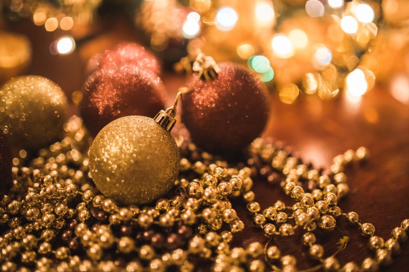
Colore e metallo

Rosso e Oro sono un must della tradizione natalizia; negli ultimi anni sono affiancati dalla versione metallica in tonalità più fredda composta da Blu e Argento. Se scegliete la prima vi consiglio di abbinarci luci calde con aggiunta di fiocchi dorati, rosso-dorati e pizzo bianco; le palline rigorosamente rosse (possono essere opache, lucide, glitterate) e/o dorate. Se scegliete la versione fredda palline blu e/o argentate con aggiunta di fiocchi argentati e blu. Le luci in questo caso saranno di tonalità bianca.

My Christmas Tree
Credit by HOME HANDMADE & MORE by Anomajdecor
https://www.pinterest.it/pin/179792210112168163/

Tinta unita in diverse nuance

Uno dei trend degli ultimi anni è fare l’albero usando un’unica tonalità per esempio usando tutte le tonalità del rosa accostato poi con i toni neutri del bianco, beige e grigio chiaro. Anche qui valgono le stesse regole : se scegliete palline rosa inserite fiocchi dalle tinte neutre e rosa di tonalità media mentre per la luce la tonalità bianca. In caso sceglieste il colore bianco, beige o tortora accostate una luce calda.

Esplosione di colori

Se siete amanti delle decorazioni multicolore il vostro estro vi ringrazierà! La scelta è infinita!! L’unico accorgimento sarà la scelta del nastro di una o al massimo di due tonalità mentre per le luci vi consiglio quelle di tonalità calda.

CONSIGLIO: Un piccolo trucchetto per creare ancora più illuminazione sono l’inserimento di palline trasparenti rotonde o a grappolo d’uva, possibilmente in vetro, che posizionate a contatto con le luci saranno iridescenti.

My Christmas Tree

Se la base dell’albero rimane a vista copritela con un sacco di juta ed avrete l’effetto Rustic Chic!

Siete pronti???

Buoni acquisti !

Francesca

Ps: ricordatevi che on-line potrete trovare offerte super convenienti

Immagine di copertina Photo by Kaboompics .com from Pexels

____________________________________________________________________________________________

Black Friday: Christmas Tree Operation

This is it now!

In a month it will be Christmas and it’s time to think about our Christmas decorations.

I’ve always been convinced that making the Christmas tree in November is therapeutic. It will be the lights or the magic that this tradition can create but for me it is exciting and my I child thanks despite the forty years.

Walking around shops these days to look for basic balls to increase to my tree, I was literally upset for the prices I saw around. If you need to shop and have a fixed badget take advantage of this Friday’s Black Friday; many shops will make discounts!

How to make a tree with the “WOW” effect?

I state that my soul is very old-style and that my 15 year old tree is still active (I leave it out two nights in the cold before doing so to make the needles swell being made of plastic). The decorations have been bought year after year; doing it from top to bottom new is really expensive nowadays but with small tricks you can get amazing results at a reasonable price.

The ECO choice. Who decides to buy the real fir, with its scent of resin, converts the choice of an local natural tree; It reconciles respect for tradition with our environment, unlike low-quality plants imported from abroad that reach Italy after a long transport with polluting means. Attention then to the size: choose one that then you could cure or relocate to a suitable place.

The three fundamental things to create a WOW effect tree are the choice of color or colors that the decorations of your tree will have , the correct choice of lights and the purchase of sparkling strips that cut will become superlative bows and fill many empty spaces.

Following I propose three types of Christmas Tree!

Colour and Metal

Red and Gold are a must of the Christmas tradition; in recent years they are flanked by the metallic version in cooler tones composed of Blue and Silver. If you choose the first one I recommend to match warm lights with golden flakes, red-golden and white lace; the balls strictly red (can be opaque, shiny, glittery) or golden. If you choose the cool blue or silver-plated version with silver and blue flakes. The lights in this case will be white.

Colour combined in different shades

One of the trends of recent years is to make the tree using a single shade for example using all shades of pink combined then with neutral tones of white, beige and light gray. Here too the same rules apply: if you choose pink balls inserted flakes with neutral and pink colors of medium tone while for light the white tone. In case you choose the color white, beige or taupe, add a warm light.

Explosion of colours

If you love multicolored decorations your inspiration will thank you! The choice is endless!! The only trick will be the choice of the tape of one or at most two shades while for the lights I recommend those of warm tones.

ADVICE: A little trick to create even more lighting are the insertion of transparent balls round or grape bunches, possibly made of glass, that placed in contact with the lights will be iridescent.

If the base of the tree remains visible cover it with a lot of jute and you will have the Rustic Chic effect!

Are you ready???

Enjoy your shopping!

Francesca

Ps: remember that on-line you will find super affordable offers

Cover Pic PHOTO BY KABOOMPICS .COM FROM PEXELS

Living e Tendenze 2020: tutto quello che c’è da sapere

Il 2020 è alle porte!

Scopriamo insieme alcuni dei trend più gettonati del prossimo anno.

Una cosa è certa: sarà il trionfo della materia, del colore e delle superfici riflettenti!

Protagonisti principali del nuovo anno che verrà saranno il gran ritorno della carta da parati (ne avevamo già avuto un’assaggio l’anno scorso) e della moquette, superfici specchiate e rielaborate, specchi e vetri colorati, contrasto di materie! Insomma come sempre ce ne sarà per tutti i gusti e sarà impossibile annoiarsi!

Vi invito a leggere l’articolo qui sotto scritto per Habitante.it

http://www.habitante.it/habitare/living-e-tendenze/nuove-tendenze-nellinterior-design-2020/

Buona Lettura,

Francesca

_______________________________________________________________________________________

Living and Trends 2020: everything you need to know

2020 is coming!

Let’s discover together some of the most popular trends of the next year.

One thing is clear: it will be the triumph of matter, color and reflective surfaces!

Main protagonists of the New Year that will be the grand return of the wallpaper (we had already had a taste of it last year) and of the carpet, mirrored surfaces and reworked, mirrors and stained glass, contrast of materials! In short, as always there will be some for all tastes and it will be impossible to get bored!

I invite you to read the article below written for Habitante.it

http://www.habitante.it/habitare/living-e-tendenze/nuove-tendenze-nellinterior-design-2020/

Enjoy the reading,

Francesca

Arredare in stile Urban Eco. Lo stile industriale si unisce all’eco-green

In un recente post vi avevo già accennato riguardo la mia passione per lo stile di arredamento Urban Eco.

A seguire il progetto artistico da me proposto per l’arredamento di cucina e zona living in cui spiego com’è nata l’ispirazione per creare la moodboard e le soluzioni adottate in base alle richieste.

URBAN ECO KITCHEN – Moodboard made by Francesca Romio

URBAN ECO KITCHEN- Kitchen view from the living room drawn by Francesca Romio

Di seguito il link dove poter leggere l’intervista : habitante.it/habitare/living-e-tendenze/arredare-in-stile-urban-eco/ .

Buona lettura!

_____________________________________________________________________________________________

Following the interview in English.

Enjoy the reading!

FURNISH IN URBAN ECO STYLE. THE INDUSTRIAL STYLE JOINS THE ECO-GREEN

What are the characteristics of the Urban Eco style?
The inspiration comes from the atmospheres of the big metropolitan cities where over the years it has been provided with the renovation for residential use of old sheds and disused factories in which there are also large windows with wonderful natural light entering.

Urban style is enjoying considerable success, particularly among young couples or singles who face the first life experiences outside their parents’ home. A style influenced by minimalism: simple and soft lines but that does not disdain the inclusion of touches of bold colors.

The designer’s advice: In the case of a new environment and small windows we should use hanging lamps and spotlights on the floor and ceiling to recover as much light as possible.


Could you describe the mood board?

URBAN ECO KITCHEN- Moodboard made by Francesca Romio


The Piemontese capital is the third economic-productive complex of the country; is the hub of the automotive industry and is also one of the most important centers for Italian industrial and cultural design. From this careful reflection I created the moodboard inspired by the brick construction of the Antonelli building and subsequently restored with reinforced concrete and steel. All three components are found in the Urban Eco Kitchen project.

Inspired by the Urban Eco Style, wood could not fail to be missing. We find it in the floor, in the table and in the boxes containing shrubs. And the green represented by aromatic and evergreen plants; symbolically therefore a further tribute to the city of the four rivers that rises in the Po valley, protected by the western Alpine chain with the Gran Paradiso massif, the main protagonist of the Turin panorama.

Naturally a touch of “cozy and comfort” furniture has been added, such as the strictly white quilt that covers the sofa bed in the living area and soft carpets to create balance.

The project.
The project’s clients are a young couple from Turin and the two-room apartment we see in the plan is located a few meters away at the foot of the Mole Antonelliana. In the project we focus on the living area and kitchen area.

What space-saving solutions have you adopted?

URBAN ECO KITCHEN – Kitchen view from the living room drawn by Francesca Romio


The layout of this environment in which the kitchen and living area must be harmonized is not huge. I proposed a modular and functional furniture taking advantage of all the possible space. Creating an equipped corner channel between the window side and the kitchenette, I figured out the long and narrow free space that was created between the shutter window frame and the washbasin cabinet.
The channel is used for everyday tableware, kitchen knives and cutting boards, spice holders etc .; in addition, in the Urban Eco Kitchen there are two modules with a removable basket, very convenient as a space-saving pantry, a cabinet for use only for glasses and cups and a column with oven and microwave.

I liked the idea of an industrial solid wood dining table with treated rusty metal legs that didn’t move and that took up exactly that space. I imagined the canteens of the factory workers. In this table you can easily cohabit in 6 people.

Also in the living area there is the insertion of a clean linear modular furniture where the crockery that is used when there are guests can be stored. The proposal to insert a fold-out sofa bed in a chaise longue style derives from the request of the client to have an extra bed in case of need.

In the first inspection, the needs of the young couple emerged: to design a simple, functional, welcoming and contemporary space. As a color table the request converged on the shades of gray. As for the lighting technology, the insertion of basic lamps and the creation of a warm environment with the use of lights. This gave rise to the solution of inserting recessed floor and ceiling lights in strategic areas of the home with diffused light regula.

Come si diventa Home Stylist e nozioni base di teoria del colore

Vi propongo in questa domenica uggiosa un interessante articolo scritto da me per la rivista Habitante.it con tema la figura professionale dell’ Home Stylist.

Article wrote by Francesca Romio

Potrete trovare spunti ed ispirazione su come rinnovare la cromia delle pareti della vostra casa e le basi fondamentali di teoria del colore!

Se siete autodidatti privi di esperienza ma con desiderio di apprendere segreti sull’uso del colore ci sono diverse lezioni online che vi possono aiutare. Potete seguire per esempio Covema TV sul canale YouTube dove l’Interior Designer Gabriella Cevrero – docente ai corsi dell’Accademia Telematica Europea  – illustra alcune triplette colore selezionate per facilitare la scelta dei progetti verso chi non è un Interior Designer.

Buona lettura !

habitante.it/habitare/design/come-si-diventa-home-stylist-lo-stilista-dellambiente

https://www.habitante.it/author/francescaromio263gmail-com/

_____________________________________________________________________________________________

HOW TO BECOME an HOME STYLIST and basics notions of Color Theory

I propose to you on this gloomy italian Sunday an interesting article written by me for Habitante.it as a topic the professional figure of the Home Stylist.

You could find inspiration on how to renew the colors of your home’s walls and the fundamental basics of color theory!

If you are self-taught without experience but you whish to learn secrets about the use of the color there are several online lessons that can help you. For example, you could follow COVEMA TV on the YouTube Channel where Interior Designer Gabriella Cevrero- professor at the European Telematics Academy courses- illustrates some color triplets selected to facilitate the choice of projects for those who are not Interior Designers.

Enjoy the reading!

URBAN ECO Style

L’Urban Eco Style”  è uno stile di arredamento che si sta imponendo sempre di più nel living quotidiano.

Non nego che sia uno dei miei stili preferiti essendo un arredo semplice ma molto funzionale con quel tocco di linfa vitale caratterizzata dal verde della clorofilla che scorre nelle piante inserite nell’ambiente. Si mescolano assieme l’antico ed il contemporaneo ispirandosi alle atmosfere metropolitane delle grandi città. 

I colori vengono creati dai metalli in contrasto con le superfici materiche come mattoni di riuso (ce ne sono un sacco e bellissimi nelle discariche di cantieri edili senza prenderne di falsi nei negozi), legno grezzo, tubature, resine ad effetto cemento. Una parete in mattone rossa o tinteggiata di un bianco sporco si accosta perfettamente ad un piano di lavoro in ghisa o pietra con mobili scuri di una cucina per esempio.


Credit from pixabay.com


Si formano effetti incredibili!

Credit from Pixabay.com

Si prestano moltissimo a questo arredamento i vecchi iutifici o magazzini restaurati ad uso abitativo in cui ci sono anche grandi vetrate; l’illuminazione per questo arredamento è importantissima. Se non si riesce ad averla con la luce naturale dovremmo utilizzare lampade a sospensione. In ogni caso si può creare questa tendenza di mobilio anche in ambienti nuovi.

Credit from Pixabay.com

All’arredamento Urban è stato affiancato il sostantivo Eco perchè caratterizzato dall’inserimento di piante sempre verdi o aromatiche inserite in piccoli vasi. Possono essere usate anche per ricoprire una parete intera e l’effetto wow è garantito!

https://pin.it/xrfqkdcaz3rigo
Credit from Pixabay.com

Seduti a leggere un libro, per esempio, nella vostra poltroncina della zona living della nostra casa, potrete avere la sensazione di trovarvi nella vostra piazza preferita perchè tutti noi ne abbiamo una nel cuore! Sloane Square a Londra e Madison Square Garden a New York sono le mie!

The “Urban Eco Style” is a style of furniture that is becoming increasingly popular in everyday living.

I do not deny that it is one of my favorite styles being a simple but very functional furniture with that touch of lifeblood characterized by the green of chlorophyll that flows in the plants inserted in the environment. Ancient and contemporary are mixed together, inspired by the metropolitan atmospheres of the big cities.

The colors are created from metals in contrast to the material surfaces as reuse bricks (there are a lot of them and very beautiful in the dumps of building sites without taking fakes in the shops), raw wood, pipes, cement-effect resins. A wall in red brick or painted an off-white perfectly matches a cast-iron or stone worktop with dark furniture for a kitchen for example.

Incredible effects are formed!

This furnishing lends itself to the old restored buildings or warehouses for residential use in which there are also large windows; lighting for this furniture is very important. If you can’t get it with natural light we should use hanging lamps. In any case, this trend of furniture can be created even in new environments.

Urban has been accompanied by the noun Eco because it is characterized by the inclusion of evergreen or aromatic plants inserted in small pots. They can also be used to cover a whole wall and the wow effect is guaranteed!

Sitting to read a book, for example, in your living room armchair in our home, you will have the feeling of being in your favorite square because we all have one in our hearts! Sloane Square in London and Madison Square Garden in New York are mine!

Come collocare gli specchi in bagno

Il bagno rappresenta uno degli ambienti più importanti della casa. Con semplici accorgimenti ed un pò di accortezza ed un tocco di buon gusto può diventare luogo fonte di benessere ed intimità.

Qui di seguito vi propongo un articolo molto interessante riguardo al posizionamento degli specchi in bagno da me scritto per la rivista online Habitante.

Article wrote by Francesca Romio

Habitante è la prima Content Marketing Agency specializzata sul mondo dell’habitat e si occupa di creazione di contenuti editoriali. E’ nata da un progetto ideato per supportare l’Osservatorio sulla Casa di Leroy Merlin Italia e sviluppato insieme a Unione Nazionale Consumatori.

transparent logo

In questa rivista online si racconta la realtà delle case e delle differenti forme dell’abitare in base alle diverse culture.

Buona lettura!

http://www.habitante.it/habitare/living-e-tendenze/lo-specchio-in-bagno/

https://www.habitante.it/author/francescaromio263gmail-com/

_____________________________________________________________________________________________

HOW TO PLACE THE MIRRORS IN THE BATHROOM

The bathroom is one of the most important rooms in the house. With simple tricks and a little care and a touch of good taste it can become a place that is a source of well-being and intimacy.

Below I propose a very interesting article about the placement of mirrors in the bathroom. I wrote for the online magazine Habitante.it.

Habitante is the first Content Marketing Agency specialized in the world of habitat and deals with the creation of editorial content. It was born from a project designed to support the Leroy Merlin Italia Observatory on the House and developed together with Unione Nazionale Consumatori.

Enjoy the reading!

MAIOLICA come forma d’Arte

Da appassionata e professionista di tutto ciò che a livello materico si può riutilizzare, oggi vi parlerò del fascino senza tempo delle MAIOLICHE.

Questo tipo di produzione di ceramica  di vasellame che risale al mondo greco (da κέραμος, kéramos, che significa “argilla”, “terra da vasaio”e tutt’oggi in uso, viene molto utilizzata nel mondo del Living. 

Può essere personalizzata inoltre in base al proprio stile per la creazione di pareti, rivestimenti e pavimenti.

Provenendo da 13 anni di restauri e ristrutturazionI di Beni Immobili è insito in me  dare una seconda giovinezza a tutto cìò che è antico, di scarto ed inutilizzato nel rispetto del manufatto.

Nei vari progetti assegnatemi, per conseguire l’abilitazione per la professione di Interior Design e che faranno parte del mio portfolio, sto impiegando questa metodologia di visione della materia.

Usando la nostra creatività vecchi pezzi di maioliche possono essere ricomposti tramite un patch-work studiato ed equilibrato e possono essere sfruttati, ad esempio, per creare angoli di “sapore mediterraneo” all’interno o all’esterno della propria abitazione e perchè no anche nel proprio ufficio ( abbiamo tutti bisogno di avere un punto focale di evasione).

In una abitazione con arredamento minimal basico e sobrio utilizzando le maioliche come rivestimento di parete si possono creare piccoli angoli di paradiso.

L’uso delle maioliche non significa solo tocco di colore ed allegria all’interno di uno spazio, ma anche REALIZZAZIONE DI UN’OPERA D’ARTE.

https://www.laudicinarubinoceramiche.com/

https://www.lavorincasa.it

https://www.ceramichecaltagirone.com

As a passionate and professional of everything that can be reused on a material level, today I will talk about the timeless charm of MAJOLICA.

This type of pottery  production that dates back to the Greek world (from κέραμος, kéramos, meaning “clay”, “potter’s land”) and still in use, is widely used in the world of Living. It can also be customized according to your style for creating walls, coverings and floors.

Coming from 13 years of restoration and renovation of Architectural Heritage, it is inherent in me to give a second youth to all that is ancient, wasteful and unused in respect of the building.

In the various projects assigned to me, to achieve the qualification for the Interior Design profession and which will be part of my portfolio, I am using this method of vision of the subject.

Using our creativity old pieces of majolica can be reassembled through a studied and balanced patch-work and can be exploited, for example, to create corners of “Mediterranean flavor” inside or outside one’s home and why not also in own office (everyone needs to have a focal point of evasion).

In a home with basic minimalist and sober furnishings using majolica as a wall covering you can create little corners of paradise.

The use of majolica does not only mean a touch of color and joy within a space, but also the REALIZATION OF A PIECE OF ART.

Mood Board: di cosa si tratta esattamente?

Benvenuti nel mio nuovo Blog!

Mi presento: sono Francesca, Artista, Tecnico del Restauro di Beni Culturali e studente di Interior Design presso l’Accademia Telematica Europea.

Con molto piacere inauguro il mio nuovo blog UMORECREATIVO affrontando un argomento molto interessante: la moodboard.

Nei miei 4 anni in giro tra Regno Unito e gli States sentivo spesso parlare con altri colleghi artisti di confrontare le nostre idee ed ispirazioni creando delle moodboard da condividere poi tramite i social.

Ma di cosa si tratta esattamente?

Moodboard significa letteralmente mood “umore” e board “tavola” quindi semplicemente non è altro che una sorta di tavola da disegno virtuale dove tramite un collage di immagini si raccolgono le idee, si sviluppano progetti, si trasmettono emozioni. In italiano viene tradotta con il termine “pannello di tendenza”.

Con l’avvento delle app come Pinterest per costruire e condividere una moodboard accattivante servono una serie di immagini di carattere che traducono nel miglior modo possibile l’idea che si sta cercando di lanciare. Nulla deve essere lasciato al caso: dalle scelte delle immagini all’impaginazione.

Nel mondo del Fashion Design, Visual Merchandising e dell’Interior Design sono un utilissimo e potente mezzo di comunicazione.

Come studentessa di ID sto imparando a sviluppare progetti di spazi interni ed esterni di abitazioni da rinnovare o semplicemente da rivalorizzare.                                                                                                           

L’uso della moodboard mi permette di creare un rapporto diretto tra il cliente e la mia idea creativa. Il cliente verrà coinvolto fin da subito da una serie di suggestioni visive che emergeranno da una determinata tipologia di arredamento ho semplicemente dalle varie nuance che verranno utilizzate.

Qui sotto potrete trovare un esempio dell’importanza di un pannello di tendenza.                                           

Da una semplice immagine ci si può ispirare e creare tramite uno schema di colori idoneo una determinata tipologia di arredamento inserendo anche immagini di fantasia.

Dai colori di quest’immagine e dal vasetto del cactus mi sono ispirata ai tramonti californiani che sono caratterizzati da un intenso viola dove prevale la percentuale del rosso, quindi una tonalità calda e avvolgente. Lo spazio protagonista di questa moodboard potrebbe essere la terrazza di un appartamento oppure il portico ad uso “salotto esterno” di una casa.

Dalle 7 tonalità di colori ricavate dall’immagine iniziale ho sviluppato la mia ricerca. Interessante notare come in questa immagine ci sia l’uso del rosso nelle varie nuance, del verde suo complementare e del grigio come ponte di bilanciamento tra le varie tonalità.


Divano 3 posti maxi MOVING

Cuscino da esterno verde con stampa foglia MAISONS DU MONDE

Cuscini da esterno grigi VidaXL

Tavolino vetro trasparente BURANO

Decking in legno LE QUADROTTE Ravaioli Legnami

Lampada Cactus Lucide 13513/01/33

Cuscino verde da esterno ITALPOUF

Welcome to my new Blog!

Let me introduce myself: I’m Francesca Artist, Technician of Restoration of Cultural Heritage and student of Interior Design at the European Telematic Academy.

With great pleasure I inaugurate my new UMORECREATIVO blog addressing speaking about a very interesting topic: the moodboard.

In my 4 years traveling around the UK and the States I often heard talk with other fellow artists about comparing our ideas and inspirations by creating moodboards to be shared later via social media.

But what is it exactly?

Moodboard literally means mood “mood” and board “table” so it is simply nothing more than a sort of virtual drawing board where ideas are collected through a collage of images, projects are developed, emotions are transmitted.                                                 

With the advent of apps like Pinterest to build and share a captivating moodboard, you need a series of character images that translate in the best possible way the idea you are trying to launch. Nothing should be left to chance: from the choice of images to the layout.

In the world of Fashion Design, Visual Merchandising and Interior Design are a very useful and powerful means of communication.

As a student of ID I am learning to develop projects of interior and exterior spaces of homes to renovate or simply to re-evaluate.

The use of the moodboard allows me to create a direct relationship between the customer and my creative idea. The customer will be immediately involved in a series of visual suggestions that will emerge from a specific type of furniture I simply have from the various nuances that will be used.

Below you will find an example of the importance of a trend panel.

From a simple image you can inspire and create a specific type of furniture using a suitable color scheme, including imaginative images.

From the colors of this image and from the pot of the cactus I was inspired by the Californian sunsets that are characterized by an intense violet where the percentage of red prevails, therefore a warm and enveloping shade. The protagonist space of this moodboard could be the terrace of an apartment or the porch used as a “living room outside” of a house.

From the 7 shades of colors derived from the initial image I developed my research. It is interesting to note that in this image there is the use of red in the various nuances, of its complementary green and of gray as a balancing bridge between the various shades.